An adventure awaits
Planner Guru takes the work out of planning your next night out. Answer a few questions, and the app crafts an outing tailored to your tastes. Originally a date-night app, they have expanded to include all kinds of outings. For this project, the client came to me with the UI elements, but required the user experience to be fleshed out. Working with these UI elements and initial client wireframes, I established the layout and experience, streamlining the user flow and functionality where opportunity arose.
Roles: User Experience

A smoother experience
The planning flow of the app needed some love. In the initial wireframes, the screens were packed with fields. This was visually overwhelming, and somewhat daunting. My goal was to simplify these screens to increase engagement and reduce bounce rate. I divided these into 4 steps to make the process more manageable and improve the overall experience. Steps are represented at the top of the screen in a tracker to show direction and progress.
For each step, fields are displayed only if they are relevant to the selection being made. For instance, in the “Who’s going?” step, if the user chooses “My friends and I”, additional fields will then be revealed for the user to enter the number of friends and to add optional contact information. If “Spouse and I” were selected, these fields would not be shown. This simplifies the experience for the user, reducing the time it takes to complete the task.
In the wireframe, the “Options” step was originally presented as a large list of checkboxes. I wanted to increase engagement by making this area more visual. The options are separated by category, and horizontally slide across the screen in order to see multiple options at once. The user can select as many options as they like, indicated by a blue checkmark.
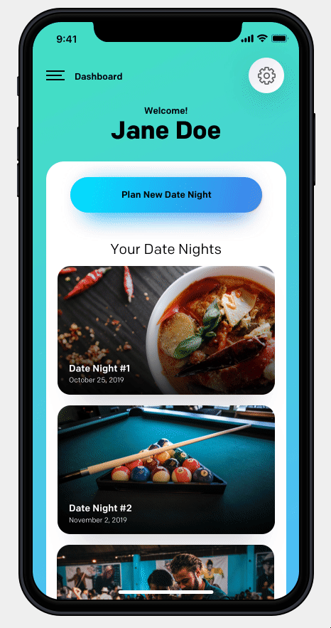
Dashboard upgrade
The dashboard was an area that was drastically overhauled. In the initial wireframe, this screen contained only three buttons: Start New Date Night, Check Status, and Edit Profile. When creating the layout I wanted this screen to be more inviting, to create a space where the user could have a sense of ownership. I also wanted to design a space that was scalable and allowed for new functionality in the future.
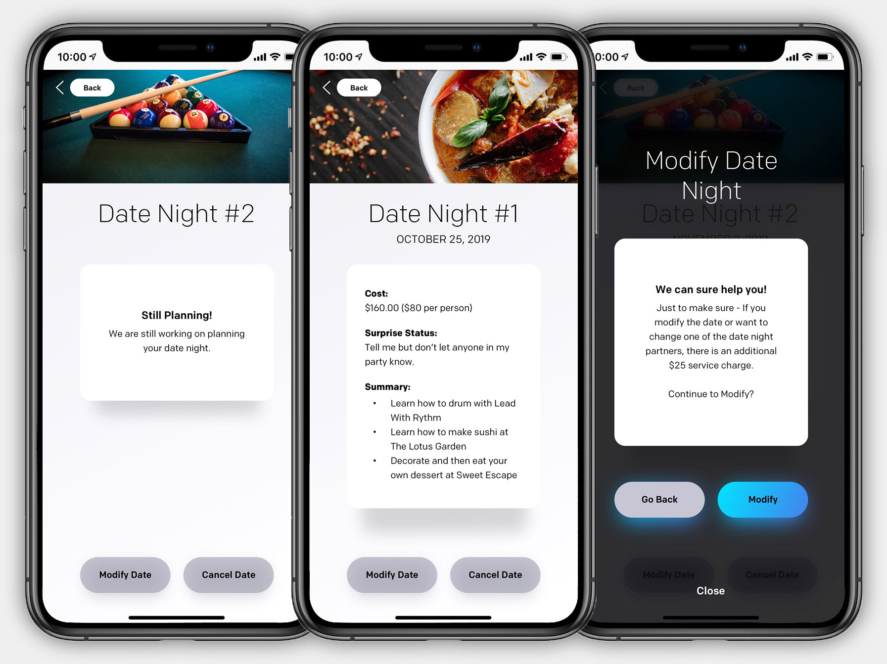
This screen was revised to display each upcoming outing, which can be clicked for status updates or preference changes. At a glance the user can see what they have planned and when it takes place. A settings button was added for the user to edit their profile or contacts. This settings menu is also designed with space for future additions, so that the current design and overall functionality of the dashboard is not compromised.
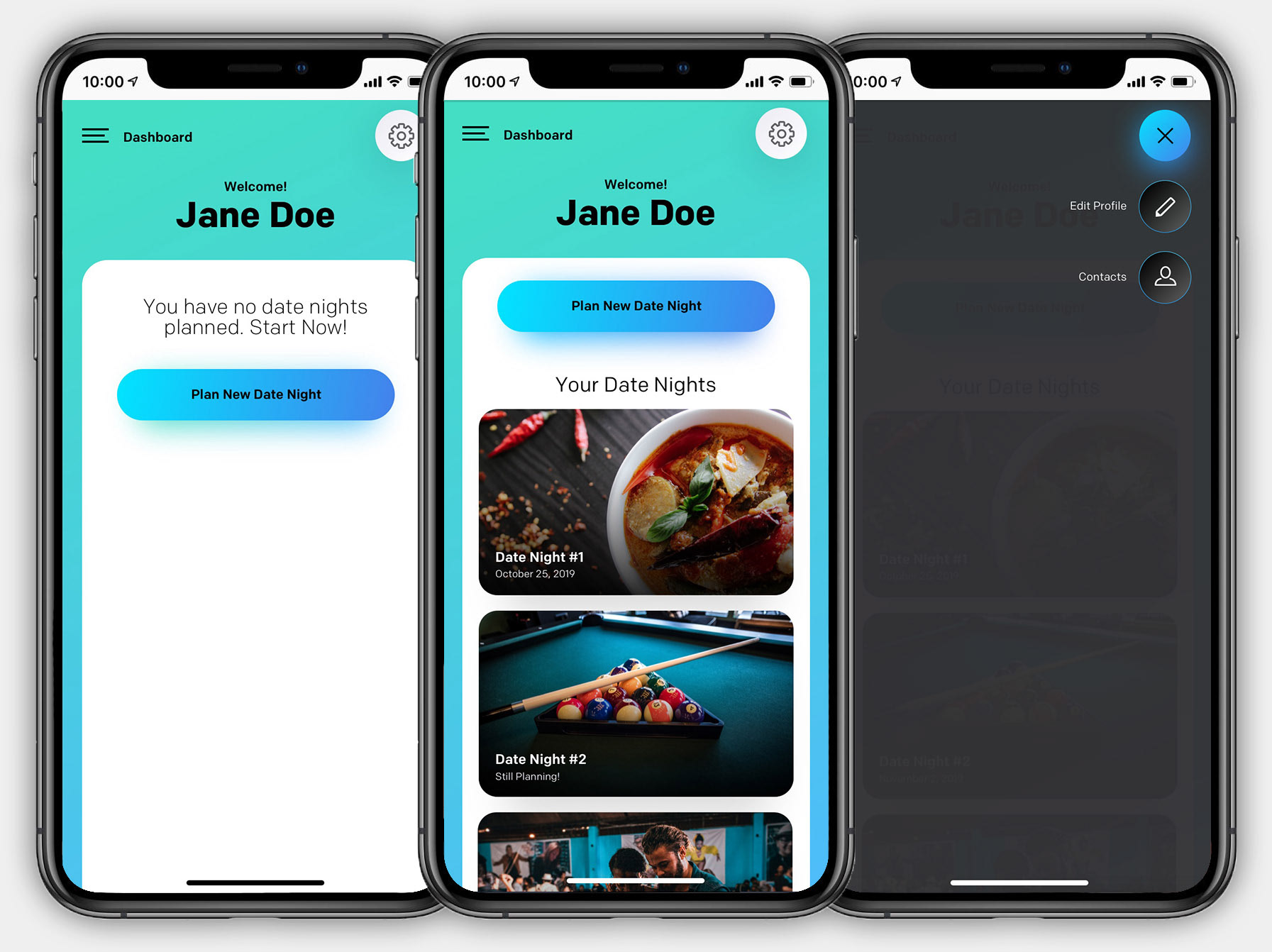
Upcoming outings are displayed on the dashboard. The user can manage these by clicking on an outing for more options. If an outing is ready, information such as date, cost, and activities will be displayed. If the outing is still in the planning phase, a message indicating this will display instead. The user can also modify or cancel from here.